Wednesday, 8 June 2011
Friday, 3 June 2011
Using different Medias
Throughout my work, i have done alot of design work which only conisted of a fine liner and collouring felts tips. I wanted to expand my work by adding an artistic touch by drawing my structure in different forms and medias. i feel this will create a different view point of my designs.
This image was drawn with HB pencils, i wannt to create a piece which was very sharp and bold to really stand out. The outlines of the structure overlap each other because i still wanted to keep sketchy design feel. The bold, sharp shadows bring the image forward and look very abstract.
This image was of my previous design, This was drawn by a fine line and a ruler. I wanted to create a detailed drawing which would give an idea of how this structure might of looked like. I feel that the lined patterns create a very nice wooden texture against the bold white surfaces. If i was to go back to this piece as edit it, i would use colour to make the image feel more realistic.
This image is an abstract design of my sculpture which i crafted onto photo paper. I wanted to represent how my structure would look in different environments. I used 3 photos of different places in colchester which then i overlapped each other. Then using a crafting knife, i cut out my abstract design and then used a marker pen to fill in some shading.
I really love the way the design stands out from the photos and creates a very abstract image.
This image is very precise drawing of my final model outcome. This way drawn with a HB pencil and graphic colored pencils. This images a good description of how the model would look like once it had been constructed. The angle of how the design has been drawn gives a good indication of its physical design. The colours which i have used creates a cool, modern feel which has been created by the blues and greys.
This piece was drawn with graphic pens in a sketchy and rough style. By how i have drawn the lines very scribbley and fast, i feel that it gives the image are very energetic and flowing style.
I feel that the bold outline of the drawing really brings the image forwards and looks very good on a white background. The blues and purples i have used gives the structure a modern feel to it.
In this image, i wanted to experiment with my structure and turn it into an object which doesn't end.
What i have done is drawn out the sculpture and then drawn out the ends into a continuous loop.
i really enjoy this image as its interesting and mind puzzling. I have given the image a lot of tone and depth which creates a 3d effect on the image.
In these next two images, i really wanted to create a futuristic and modern effect which would reflect on my sculpture. by creating a futuristic effect, i decided to drawn a circular pattern which was constructed out of multiple lines which overlapped each over. This create some sort of a graphical vortex which had a checkered pattern. I then drew my sculpture over the top of this vortex using blue graphic pencil, reason why i didn't use a black pen is because it would make the image too bold and not blend in with the vortex drawing. BY what i have produced i feel that i create my desired outcome which is a futuristic and modern effect. I would like to expand on this by using different scales and colour themes.
This is was made out of materials rather than drawing. The materials i used was a red fabric sheet which had a very nice white stringy pattern and electrical tape. I used the electrical tape to create shadow on the structure and used the red felt to make the light areas of the structure. not only this image as turned out good by using other materials, it also creates a very textured surface and feel to it.
Photoshop Structure
In this section, I have taken a few photographs of my block structure model and then photo shop the background of the surrounding buildings. This gives me a better indication of what the real thing may look like. I am very pleased of the outcome as it looks very realistic. I feel the scale of the model could be a bit big compared with the other buildings as it feels a bit small.
When i come to construct my final model. I shall add a solid floor area under the structure and plants around the outside.
This shot is fantastic as it shows me the scale of the buildings and the person walking in the backdrop.
I shall use this photo to help me construct my larger model.
These are a few close up shots as if you were standing next to the structure. I was unable to get the structure and buildings both in focus
Proto-type architecture Models
These are a few proto type models which i have constructed out of crafting paper.
The first model is of my modern gazebo which features a hole in the main support wall.
Now i have constructed this model, i can see that this design is very basic and limited. I feel that it needs to be redesigned as it can only provide a small space.
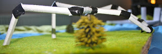
This model is of my block sculpture, I really enjoy this design as it is really unusual. I like how it extends across the area as if it was some kind of snake. The white body of the structure really stands out from the grass and gives a modern feel to it. I think this model gives me a good idea of how the real structure could look like. to find out how it might look against the surrounding buildings, I shall make a back drop and photo shop it in with the other buildings.
Thursday, 2 June 2011
Jim Sanborn
Jim Sanborn has had work exhibited at the High Museum of Art, the Los Angeles County Museum of Art, the Phillips Collection and the Hirshhorn Museum. He has been commissioned to create artwork for such sites as the Massachusetts Institute of Technology, the Central Intelligence Agency and the National Oceanic and Atmospheric Administration.
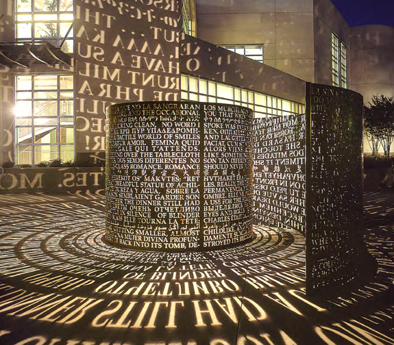
Mr. Sanborn is noted for his work with American stone and related materials that evoke a sense of mystery and the forces of nature. He is probably best known for the "Kryptos" sculpture installed at CIA Headquarters in 1990, which displays encrypted messages which continue to stump code-breakers to this day.
Mr. Sanborn is noted for his work with American stone and related materials that evoke a sense of mystery and the forces of nature. He is probably best known for the "Kryptos" sculpture installed at CIA Headquarters in 1990, which displays encrypted messages which continue to stump code-breakers to this day.
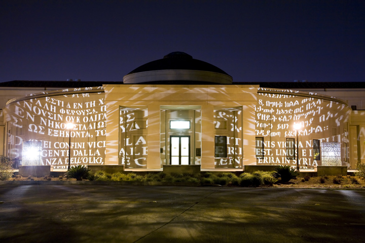
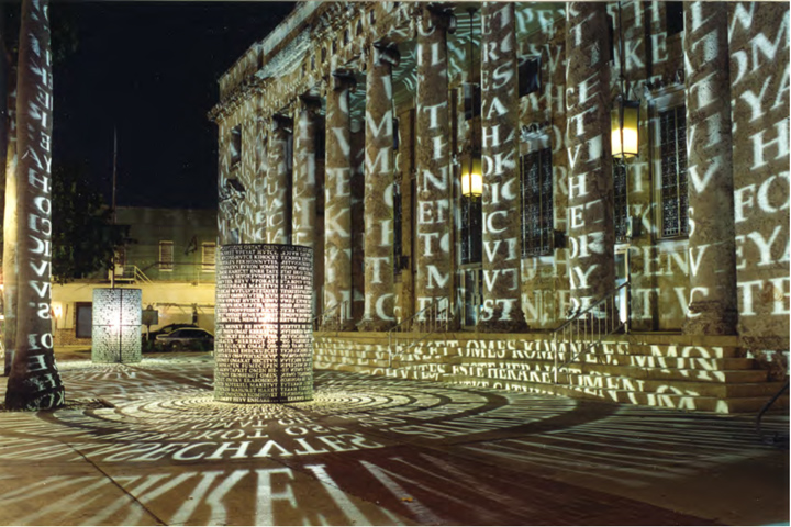
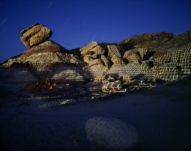
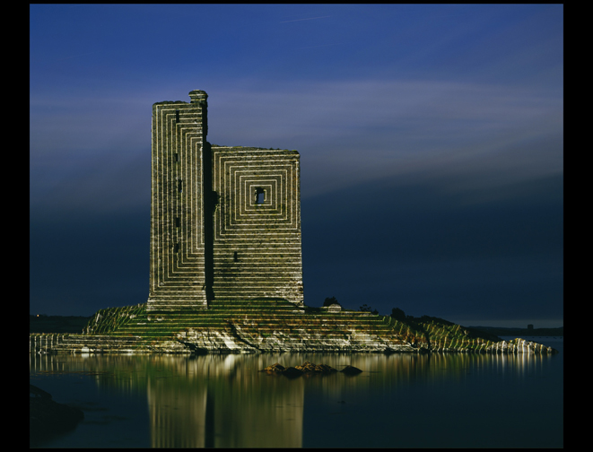
i really enjoy these pieces of work by how the projections make the building seem more unique and spectacular. The projections on the second image almost make the surrounding buildings look ancient.
Lux, 2001
A Comma, A, 2004
Below are my favorite pieces of work created by sanborn, it reminds me of my earlier work with my cube construction. The projected lines on the cliffs are similar to my construction lines on my work.
My current work is similar as well by the use of lines, My work has alot of lines which form frids and other patterns.
My current work is similar as well by the use of lines, My work has alot of lines which form frids and other patterns.
Longsturn County Cork, Ireland, 1997
Design Ideas III
In this section , i have drawn up a few more design ideas for my social area space. These design ideas were inspired by the work at the design museum, London. all of these designs have different properties and much more unusual and interesting structure than my other designs.
This design below is a sort of 90 degree dome which have been separated into three different compartments. Each section has built in benches and tables. In the lower middle of the design, There is a big rounded coloum pillar which supports the above floor, The coloum also cascade water feature which runs down into the base of the coloum. I feel that a water feature in any design gives a flowing and energetic atmosphere within the design. At the base of the column, There is a bench which goes around the the base.
On the top of the structure, There is a as second floor which has railing around the edges. This top half of the structure allows people to enjoy the outside with no shelter over the top of them.
The second half of the design is a huge raised area which people can walk up onto. ontop of the design are strange and unusal little structures which act like umbrellas. I feel this section makes the rest of the design complete has you would be able to view the whole stucutre from the raised area.
At the base of the raised area, i have designed a large water fall which would give the design life and feel alive from the splashing of the water fall.
Subscribe to:
Comments (Atom)


