Saturday, 19 February 2011
Life figure drawing
These 3 life figure drawings where drawn from charcoal, chalk and a rubber.
i feel that when using charcoal to draw a figure, i can create more dense detail lines as well as creating smooth edges. i can then use the chalk to bring back some of the figures lighter parts and separate tones. when using the rubber, i rubb out parts of the charcoal to create soft and rounded smudge marks which creates a fleshy texture. i then re use the charcoal to go back and fill in any other textures such as bone and muscle.
These figure drawings were very enjoyable and i am very pleased with the outcome. i feel that its important as an architect to be able to draw other objects besides materials and building designs, as it enables me to draw freely and fluent.
Wednesday, 16 February 2011
3D CAD Design
These images where design and created on CAD software program. These two sculptures are of the packaging which i have been studying on. Using the CAD software i wanted to try and turn the packaging into a building. Creating the main body was fairly easy and straight forward. Next i started to draw out and make inversions, the inversions of the packaging where turned into balconies with a railing. I then curved all the edges and started to create a similar looking shape to the actual packaging. Once all the structure was drawn out and completed, I then opened up Photo shop to add in color and texture to show what it would look like as a building.
I really enjoyed this as i am able to show my abilities in a digital form.
Thursday, 10 February 2011
Car sketches
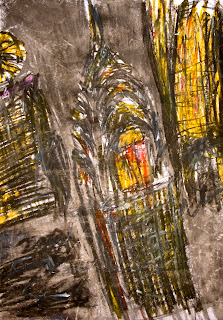
Theses are a few quick 30 second sketches of cars ive done in the college car park. These cars where drawn to link into my car intervention project. the whole idea of drawing theses cars is to view them as a different form from just transport but instead as art. My intention when drawing these cars was not to actually draw the car but by drawing very quick lines and shades which then formed the shape of a car. These drawings remind me of prototype models of cars in development as they are simple and no drawn detail.
This is a cartoon sketch of a Mclaren , This is non related to my work but i enjoy drawing this style of cars in my free time
Proto-type architecture drawings
These are a few more drawings of architecture design i have done. these drawings where inspired by a book called "Images" which shows pictures of modern architecture designs and buildings.
The first Image is of a multistory car park which has blue metal strikes zigzaging across the structure.
I feel that these blue zigzaging lines create energy and movement within the building. I feel that when drawing a design for a building, it must show energy and moment as it creates interest and fascination towards the viewer. I feel that it is how much energy and movement which you can see within the design which makes the design itself successful.
The Second image is of a completely abstract building which is constructed of "shards" such as triangles and plated with glass. This building design is very unusual and strange but creates sparks curiosity as if it was built. This design reminds me of other buildings which have been influenced by cubism.
John Pawson
 Halifax, UK, 1949
John Pawson's distinctive approach to modern architecture has attracted international attention. His work has been built in Spain, Japan and America as well as in Britain. His designs explore fundamentals - space, light and materials - and avoid stylistic mannerisms.
Educated at Eton, Pawson worked in his family's Yorkshire textile mill before spending four years teaching in Japan. He returned to study at the Architectural Association in London, setting up his own practice in 1981.
His architectural career to date has spanned a wide variety of projects, ranging in scale from a compact apartment for the writer Bruce Chatwin, to Calvin Klein's flagship store in Manhattan and airport lounges for Cathay Pacific in Hong Kong. Work in progress includes commissions to design a number of private houses around the world and a new Paris store and private Manhattan apartment for Calvin Klein.
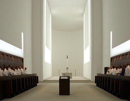
In 1999 John Pawson was commissioned by Cistercian monks to design a new monastery for a site in Bohemia. The scheme combines elements retained from the original baroque complex with entirely new architecture.
While some of the vocabulary is without literal precedent, the design remains true to the spirit of St Bernard's twelfth century architectural blueprint for the Order, with its emphasis on the quality of light and proportion, on simple, pared down elevations and detailing.
The Hotel Puerta América project brings together a team of collaborators which includes Jean Nouvel, Marc Newson, Zaha Hadid, Norman Foster, Christian Liaigre, David Chipperfield, Kathryn Findlay, Jason Bruges, Arata Isozaki, Jonnie Bell, Harriet Bourne, Ron Arad, Plasma Studio, Araki, Richard Gluckman, Teresa Sapey, Vittorio & Luchino, Felipe Saes de Gordoa, Javier Mariscal, Fernando Salas and Arnold Chan.
Ascending the entry ramp, guests pass from the sensory confusion of Madrid into the curved cloister-like space of the Pawson lobby. Light bathes walls and water washes over stone. Here is territory which deals graciously with the rituals of arrival and departure, but which has a strong sense of place, balancing a desire for theatre with the need to feel comfortable.
Wednesday, 9 February 2011
3D drawings
These are a few 3d structure drawing which i have been done using a fine felt tip pen and edged tipped coloured pens. I really enjoy this type of drawing as i can be very technical and yet artistic at the same time. My favorite work out of these drawings is the last images. The reason why i enjoy it soo much is because there is much bold colour used yet showing technical drawing lines. This drawing is of the piece of polystyrene packaging which i have been studying on. i have converted into a potential realistic and operational building.
Tuesday, 8 February 2011
3d structure
These are a few technical drawing which i have produced from the polystyrene packaging which i have been studying on. I have tried to make the packaging into a realistic building. I have tried to keep the same basic shape however i have edited a few parts to fitt in the stairs . i am very pleased with the outcome as it potential to become a real structure.
Car Intervensions
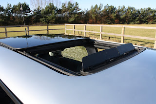
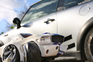
This is a small project which was set to help us expand on our colchester intervention work. The aim is to look at and draw individual parts of the car e.g bonnet, engine, textures etc.. and try and capture the energy and feelings about each part. I decided to get a few cars with are very out of proportion by parts of the car enlarged and photographed them against a real car. I real like how the scale of the cars plays with the images which creates a cartoon effect.
Subscribe to:
Comments (Atom)


